Social Vulnerability Index: Same but Different
URL not ready for publication
ongoing
Javascript, Mapbox

This image is the first sketch I made using Census data
This is a series of maps and visualizations that use satellite images to explain the Social Vulnerability Index(SVI). In 2020, the Center for Spatial Research collaborated with public health researchers at to use the SVI to allocate community health workers and vaccines. I became acquainted with the index through this work and was motivated to understand the mechanics of the index further after learning about its many uses especially in the pandemic.
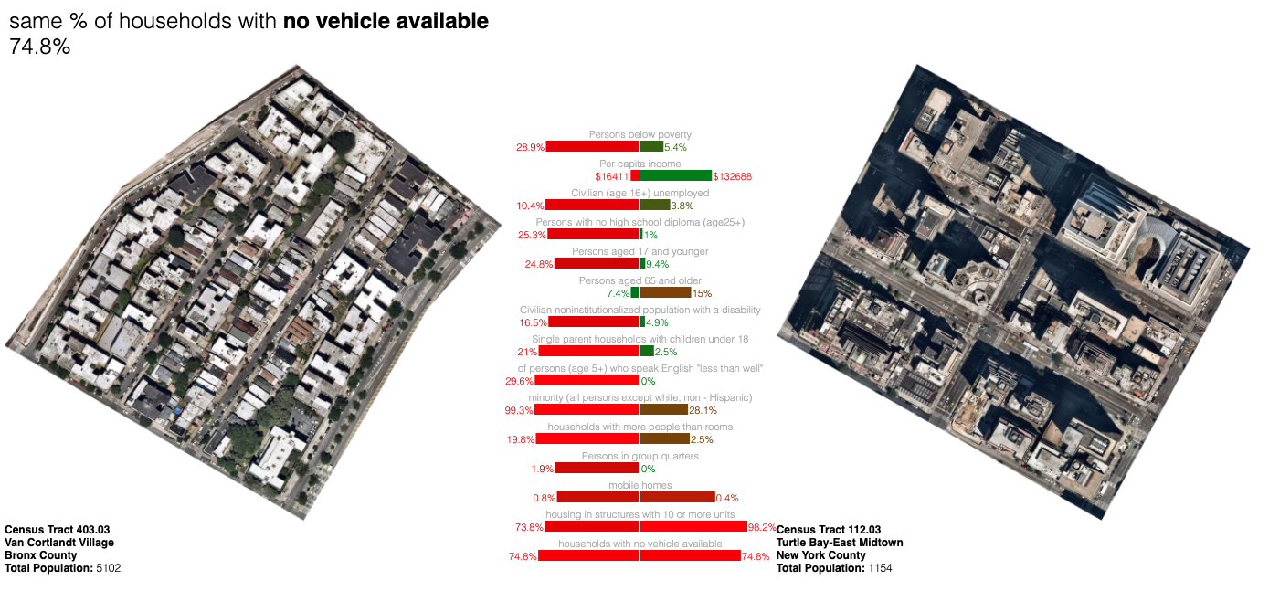
The first part of this project is called Same but Different and consist of a series of comparisons between tracts that have identical scores by a subset of metrics but are otherwise extremely different. Each Census tract has a different composition when it comes to metrics for vulnerability, this also means that even when places are similar in one way, they may be very different in others. These pairs below are a small initial sample of this initial test.
I am currently working on this project, some in progress interactive sketches can be found here:
https://centerforspatialresearch.github.io/svi_rankings/
https://jjjiia.github.io/satellite_comparisons/display_lists.html